

The pattern looks the same at every shop I have run image generation for, and at the personal site I run image generation for now. Someone burns a weekend on a beautiful prompt, ships two great renders, then watches every image after the fifth slowly drift away from the brand. The fix is a grammar, not better prose.
I have shipped a little over two hundred bespoke renders for a single site so far, all at the same iridescent-glass palette, and the consistency held because I stopped writing prompts as sentences and started writing them as a four-field template. This piece is the pattern library: the grammar, three instances I have watched it survive, and the parts that quietly do most of the work.
The pattern: a grammar, not a prompt
The grammar has four fields. Anchor, modifier, negative, reference pin.
The anchor is the shared shape of every image in the batch. On this site the anchor reads roughly: atmospheric landscape, electric blue and hot pink rim glow, single dominant subject, off-center composition, shallow depth of field, fills the frame. Those clauses do not change between renders. They are the brand, restated as a structured prompt, every time.
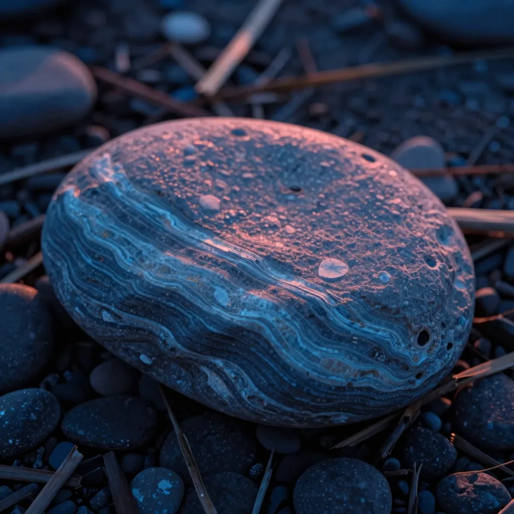
The modifier is the only field that swaps per image. For the article cluster on local AI image generation, the modifier was a rotating set of natural forms: fjord at sunset, salt flats mirror, slot canyon, obsidian lava field, ice chasm depth. One modifier per slug. The modifier carries the metaphor that a particular article needs; the anchor handles everything else.
The negative is the brand's no-list: people, vehicles, text or logos are excluded from the frame. A second tier of negatives exists for technical reasons: words like mouth, teeth, lips, or eye are banned even as metaphor, because Z-Image Turbo turns those words into anatomy you did not want. Spacecraft, looks-like animal metaphors, and dragon-spine ridges are also excluded. The negative list reads boring. It is the field that holds the brand together.
The reference pin is optional. When a prior render hit GOOD on the verdict ledger and I want a sibling image at the same texture, I pin the reference and let the model carry forward visual properties that are easier to show than to describe. I use this maybe one in eight renders.
The grammar is the unit of reuse, not the sentence. I store the anchor and the negative in a snippet, the modifier in a per-slug field, and the runner assembles the four pieces before each call. When I want to tweak the brand, I edit the anchor file and the next batch picks it up. When I want a new article hero, I write twelve words into the modifier slot and that is the entire creative act. Every other field is fixed.

Instance one: 80 article hero images at one palette
The first instance is the cluster of article heroes for this site. About eighty so far, with another forty to go before the end of the quarter. All of them ship under the same iridescent-glass-and-sky palette. None of them feel like stock.
The shared anchor was the result of about three rounds of revision. Round one was prose. I wrote each prompt freehand, leaning on flair, and ended up with a folder of images that were individually fine and collectively chaotic. Round two introduced a palette anchor and a rim-glow clause; the variance dropped immediately. Round three cut the anchor down to its load-bearing words and added the explicit single-subject rule, which was when the hit rate stopped being heroic and started being boring in the good way.
What changes per article is the modifier. The cluster on local AI generation got natural-form modifiers: fjords, salt flats, lava fields, ice chasms. The cluster on attribution and CAPI got a different modifier vocabulary built around minerals and fractal interiors, and that vocabulary lives in its own snippet too. The grammar stays the same; the per-cluster modifier vocabulary swaps. That is how the site reads as one place even though no two heroes share a subject.
When the grammar holds, the hit rate runs at roughly half. About one in two prompts produces an image I can ship without a reroll, against the same operator and the same model. When I cheat the grammar (this happens; I get tired and I write a sentence instead of filling the four slots), the hit rate falls to maybe one in five and the renders stop matching the rest of the site. The pattern is not subtle. The hours where I respect the four fields are the hours that produce shippable batches.
The full wiring of the runner that assembles those snippets and dispatches them to a GPU box is covered in the dual-machine pipeline that drives this whole image system. The grammar is the input. The pipeline is the muscle.
Instance two: in-article companion frames
The second instance lives inside the articles, not at the top. Most of the longer posts on this site carry two or three inline companion frames that show the article's subject from a new angle. Not a different subject. The same subject, lit differently, framed differently, scaled differently.
The grammar still works here, with one critical adjustment. The modifier slot does not rotate freely. It rotates within a single subject's geometry. If the article hero is a fjord at sunset between two cliffs, the companions are: the cliff face up close, the water surface at sunset, the seam where rock meets water, the distant mountains past the fjord opening. All the same scene. None of them is "now show me a salt flats mirror."
This sounds obvious until you watch yourself break it. The first batch of companions I generated for a long article had three completely different subjects, because each prompt looked good in isolation and I was not thinking about cohesion. The article rendered like a magazine spread that hired four different illustrators. After that batch I added a hard rule to my prompt notes: companions are one of the same hero subject, varied by angle, distance, scale, or lighting only. That rule lives in the modifier-vocabulary file for every cluster. It is part of the grammar now.
The fail mode for companions is multiplication. The model wants to give you abundance: a cluster of fjords, a row of monoliths, three of the same hero in formation. That always reads worse than a single subject from a new angle. The negative-list field on companion prompts grows by one clause: no cluster, no lineup, no pair, no formation. The single-subject rule from the brand anchor becomes the operative discipline for inline frames, restated.
Instance three: an off-brand experiment that proves the pattern
The third instance is the week I tried to break the rules on purpose to see what would happen.
I had been running the grammar for about six weeks and I was suspicious that I had over-fit. Maybe the structure was a crutch, and a more talented prompt would do better with prose. So I spent a Sunday writing thirty freeform prompts for the next batch of article heroes. Each one was a paragraph. Each one had its own voice. The modifier-vocabulary file sat unused on the desk.
The next morning I reviewed the results on my phone, which is how I always grade a batch. The verdict ledger told the story. Of thirty freeform prompts, six rendered as something I could call shippable. Three of those six matched the rest of the site's brand. The other three were beautiful but obviously off-brand; they would have stuck out next to their siblings in the article index. The remaining twenty-four were a mixed bag of pretty-but-wrong, technically broken, or duplicated. The hit rate was roughly half what the grammar produced, and the brand-fit rate was about a fifth.
I logged the result and went back to the grammar. The next batch ran the four fields cleanly and came back at the rate I had come to expect. The pattern survived a deliberate stress test, and I now have a clear number to point to when somebody asks why I do not just write better prompts. Better prompts are not the constraint. Reusable prompts are.
That experiment also produced a longer entry in the verdict ledger that I still consult when I am tempted to wing one. The cue extractor in that tool reads the BAD verdicts back to me, and most of the BADs are on the rounds I improvised.

“Better prompts are not the constraint. Reusable prompts are.
”
Why color-palette tokens beat prompt poetry
The single biggest lever in the grammar is the palette tokens. Three of them carry most of the consistency across every render on this site.
The first token is electric blue. I do not write "electric blue" in the prompt; I write the hex-grade language the model responds to: cobalt, ultramarine, deep blue with high saturation, glow. The closer I keep that vocabulary to a fixed list, the more the model returns the same blue across every render. Mood language ("a cool, oceanic, contemplative blue") drifts. Hex-adjacent language ("deep cobalt rim light, ultramarine glow at the edge of the form") holds.
The second token is hot pink. Same rule. Magenta, hot pink, fuchsia, neon pink rim, glow at one quarter intensity relative to the cobalt. The model gives me the same pink back, batch after batch, when the language is consistent. When I get loose ("a pop of pink") the pink shifts; sometimes it lands as salmon, sometimes as berry, and a salmon pink in one render destroys the cohesion of the whole article it sits in.
The third token is the field around those two: a near-black or very deep midnight backdrop, a cool gradient sky, a paper-white highlight on the brightest single edge of the subject. That is the brand backdrop. It almost never changes. I have it written down in the anchor snippet word for word.
Hex-grade language beats mood language because diffusion models are not literary critics. They are pattern matchers. When the input vocabulary repeats, the output vocabulary repeats. When the input vocabulary varies, the output vocabulary varies. The grammar exists, in part, so the same words show up in the same slots every time and the model is given no excuse to drift.
Where the palette consistency leaks: outdoor scenes that include a named light source (sunset, sunrise) often introduce warm colors the brand does not want. The fix is to specify "rim light only at cobalt, no warm reflections," which the negative field handles. Named objects (a phone, a chair, a building) drag in a baseline palette of their own that the brand cannot override; this is one of several reasons the modifier vocabulary on this site is almost entirely natural forms. And looks-like metaphors (a kraken-island, a dragon-spine ridge) drag the palette toward whatever the model thinks a kraken or a dragon should look like, which is almost never the brand.
The negative list as a load-bearing field
The negative is where I spend the most editing time, and the field that gets the least respect when people first see the grammar.
There are three layers in the negative on this site. The brand layer: no people, no vehicles, no text, no logos. That layer almost never changes. The model-specific anatomy layer: no mouth, no teeth, no lips, no eye, no throat. That layer exists because Z-Image Turbo will read those words even as metaphor and start drawing literal anatomy on what was supposed to be a glass form. I learned that the hard way and have it in the snippet now. The third layer is per-cluster. For the local-AI cluster on this site the negatives include no spacecraft, no astronaut, no looks-like animal metaphors. For other clusters the per-cluster layer reads differently.
The reason the negative is load-bearing: a positive prompt tells the model what to render, but it does not tell the model what the brand will not tolerate. Two different subjects can both match an anchor and a modifier and both fall well outside the brand. The negative is where the brand says, in writing, where its edges are. Without it, the brand is a rumor.
I keep an audit step on the negative list. Once a month I open the verdict ledger and read every BAD note from the prior thirty days. Any phrase that shows up twice gets promoted to the negative list. The list grows. It almost never shrinks. The first negative list I wrote for this site had four lines. The current one has fourteen.
The model-specific quality comparison I run before assigning a cluster to a model feeds the second layer of the negative directly. When a model fails on a category, the failed category becomes a negative. The negative list is partly the brand and partly a record of which models failed at what.
How to spot style drift early
The earliest signal is the phone review. I render a batch overnight and grade it on my phone in five minutes the next morning, one tap per image, GOOD MAYBE BAD with a one-line note. When the MAYBEs start trending toward a theme ("too warm," "wrong blue," "subject lost in negative space") the brand is drifting. If I catch it within one batch, I tighten the anchor and the next batch is back. If I miss it for two batches, the drift shows up in the article index and somebody is going to notice.
The reference pin is the next safety layer. When I see drift on a category, I pin the last GOOD render in that category as a style reference and let the model carry the forward properties that prose cannot capture. The pin is not free. It locks the render close enough to the source that genuine variety becomes harder. I use it as a recovery tool, not as a default. About one render in eight uses the pin. Maybe one in twenty needs it.
One generation per concept is the third discipline. Variants are a trap. I used to render two or three variants per prompt assuming I could pick the best one. In practice the variants converge on something close to the same image, the review burden triples for a marginal quality gain, and the urge to ship the slightly different second render starts a slow drift across the batch. I render one image per concept now, no exceptions. If I do not like it, I reroll the prompt; I do not pick a sibling.
The cumulative discipline is unglamorous and it works. The grammar holds the brand. The phone review catches the drift. The reference pin recovers from drift when it sneaks past the review. The single-render rule prevents drift from compounding inside a batch. None of these are clever. All of them sit on top of the local image-generation pipeline I dispatch from a Mac to a GPU box, and the pipeline only stays useful because the grammar above it stays useful.
Frequently asked questions
What does visual consistency for AI-generated images actually require in practice?
A reusable four-field prompt template (anchor, modifier, negative, optional reference pin), a fixed palette vocabulary written in hex-adjacent language rather than mood language, a per-cluster modifier list that lives outside the prompt itself, and a verdict review on every batch so drift is caught inside one round. The model and the GPU matter much less than the consistency of the four fields.
Why are color-palette tokens more important than well-written prompts?
Diffusion models are pattern matchers. Repeated vocabulary produces repeated output; varied vocabulary produces varied output. Mood language ("a cool, contemplative blue") drifts because the model can interpret it differently each call. Hex-adjacent language ("deep cobalt rim light, ultramarine glow") holds because the same words trigger the same regions of the model's color space. The point of the palette token is to be the same every time, with poetry as a distant second goal.
How big does the negative list need to be?
Bigger than you think. The site I run started with four negative clauses and now runs at fourteen. The brand layer is small. The model-specific anatomy layer is short but vital. The per-cluster layer grows steadily as the verdict ledger reveals which categories the model fails on. A negative list that has not grown in two months is probably hiding drift.
When is reference-image pinning worth the cost?
About one render in eight, and only as recovery. Pinning locks the model close to a source render, which buys consistency but flattens variety. I use it when a category starts drifting and I want to anchor the next round to the last GOOD render in that category. I do not use it as a default because batches built entirely on pins read repetitive rather than consistent.
Should I render variants per prompt and pick the best?
No. Variants converge on roughly the same image, the review burden triples, and picking the slightly different second render starts a slow drift across the batch. One render per concept. If it does not land, reroll the prompt itself. The discipline costs almost nothing and the consistency benefit is large.
Does this grammar transfer between models?
Mostly, with caveats. The anchor and the brand layer of the negative move cleanly. The modifier vocabulary moves cleanly. The model-specific anatomy layer of the negative does not transfer; it has to be rebuilt for the new model from the verdict ledger of the first batch. When I moved a chunk of work from one local model to another I copied the anchor verbatim, copied the brand negatives verbatim, and rewrote the model-specific negatives from scratch. The first batch on the new model came back inside the brand.
Sources and specifics
- The grammar is in production on this site across roughly two hundred unique image generations to date, all at the same iridescent-glass palette. Exact counts and verdicts live in the per-slug verdict ledger on disk.
- The hit-rate numbers (~50% with the grammar, ~25% on freeform-prose week) are from a single operator's reviews on Z-Image Turbo via a local pipeline on consumer hardware.
- The model-specific anatomy negative ("no mouth, teeth, lips, eye") is documented in the cumulative ledger of failed categories; it is Z-Image Turbo behavior and may not transfer to other diffusion models.
- The three load-bearing palette tokens on this site are the brand cobalt-and-ultramarine blue, the brand hot-pink rim accent, and a near-black midnight backdrop; the exact wording lives in the anchor snippet referenced by every render in the batch.
- The "one render per concept" rule was set after observing that variants converge on the same image and inflate review time. It is a single-operator finding, but the pattern is consistent across the local generation work covered in the safety wrapper that lets the Mac run image batches without thrashing.